


What GPT Image 2 Can Do for a Book Cover and What the Platforms Require
- Posted in:
- Artificial intelligence
The cover is the only part of your book most people will ever see.
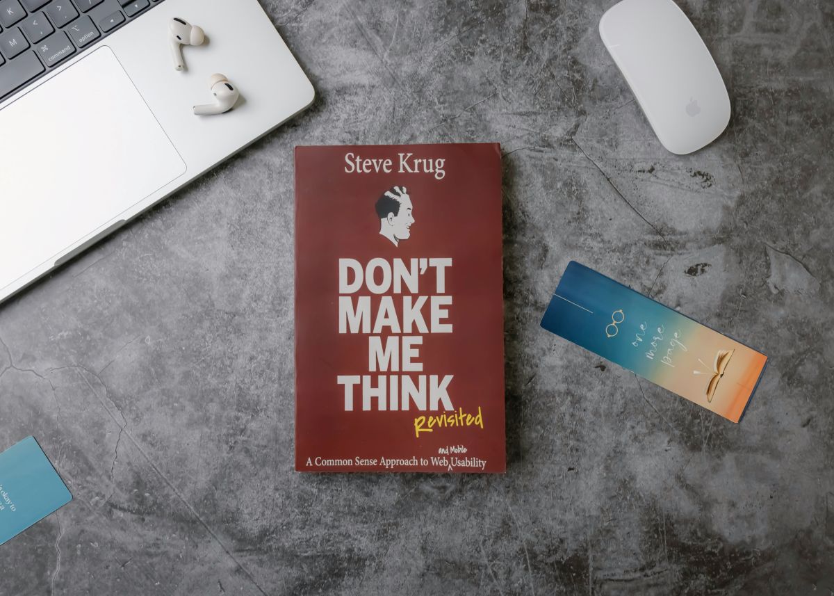
A reader browsing a store sees a rectangle about the size of a postage stamp, decides in roughly a second whether to look closer, and move on. Everything you spent two years writing is behind that decision.
Which makes it strange how many self-published authors treat the cover as the last job, done in a rush, by whoever is available, at the size it looks good on a laptop rather than the size it actually sells at.
There are also technical requirements that reject files outright, and most first-time authors discover them through a failed upload rather than before producing anything.
GPT Image 2, OpenAI's image model, can create detailed cover designs with accurate text placement. Higgsfield offers AI image creation tools for exploring different cover styles and layouts. Getting the dimensions right is still essential before creating the final design.
Why does thumbnail size decide everything?
Because that is where the browsing happens, and nothing else is seen first.
A cover appears in store listings, search results, also-bought carousels and recommendation widgets at a size considerably smaller than the file you designed.
At that size:
- The title has to be readable, which rules out most script and decorative faces
- Fine detail disappears entirely, including texture, small elements and thin lines
- Contrast does the work, since subtle tonal relationships vanish
- One focal point survives, and a busy composition becomes noise
- The author name matters more than new authors think, since returning readers search by it
Design at full size in GPT Image 2 and check the thumbnail constantly. Shrink the image to about an inch tall on your screen and look at it from arm's length. If you cannot read the title, nobody browsing will either.
That single test catches more cover problems than any amount of critique.
What does genre signaling actually mean?
That your cover tells a reader what kind of book this is before they read a word, and getting it wrong costs sales regardless of quality.
Every genre has visual conventions that readers use to navigate. Thrillers look like thrillers. Cozy mysteries look nothing like police procedurals. Romance subgenres are distinguishable from each other at a glance by people who read them.
Those conventions exist because they work:
- Readers filter by them unconsciously while browsing
- Breaking them signals either a different genre or an amateur production
- Store algorithms surface books alongside visually similar ones
- Reader expectations set by a cover affect reviews when the book differs
The research is unglamorous and essential, and it takes twenty minutes rather than an afternoon. Look at the top twenty books in your exact subcategory, note what they share, and work inside that vocabulary rather than against it.
Originality on a GPT Image 2 cover belongs in execution rather than in category. A thriller that looks like literary fiction does not read as sophisticated, it reads as mislabeled.
Where does GPT Image 2 fit?
In the production, which for most self-published authors is the barrier rather than the ideas.
- GPT Image 2 cover concepts, several of them, so you can compare directions before committing
- Typography, which is most of what a cover is and where GPT Image 2 is genuinely strong
- GPT Image 2 background and atmospheric imagery behind the type
- GPT Image 2 series treatments, so books two and three belong with book one
- GPT Image 2 promotional variants, including social cards, banners and advertising sizes
Higgsfield runs it in a browser, which matters for an author working on whatever machine they wrote the book on.
The series point is worth emphasizing. A series where each cover looks unrelated loses the recognition that drives the second and third sale, and establishing a treatment at book one is considerably easier than retrofitting it later.
What rights problems do authors run into?
Several, and they are more common than the community admits.
- Editorial use only images cannot be used commercially, which a cover is, and this catches people constantly
- Stock licenses vary in what they permit, including whether the image may appear on merchandise
- Font licenses frequently require a commercial license for published work
- Recognizable people in photographs need a model release
- Recognizable property and trademarks have their own restrictions
Read the license for every asset. Save a copy. Note the license number against the book, in the same place you keep the manuscript.
That last habit matters when somebody queries a cover two years later and you cannot remember where the image came from.
For anything produced rather than licensed, check the terms of whatever tool you used regarding commercial use of output, since those vary and some restrict it on free tiers.
What should never appear on a cover?
Claims you cannot support and people who did not consent.
- Never point GPT Image 2 at a real person's likeness, which for a cover is both a rights problem and a reputational one
- Never imply an award you have not won, including laurel wreaths with invented text
- Never fabricate review quotes or attribute them to publications
- Never imitate another book's cover closely enough to confuse buyers
- Never use a bestseller claim without a basis for it
The award laurels are specific and surprisingly widespread. Readers and retailers both notice, and a fabricated accolade on a cover undermines everything else about the book.
Series imitation is the other common failure. Making your book look like a successful one in the same genre is conventional. Making it look like a specific book by a specific author is a different thing.
What are the actual file requirements?
Different for ebooks and print, and the print one surprises people.
Ebook covers are a single portrait image, in a defined aspect ratio, at a resolution sufficient for display rather than print. Requirements vary between platforms, so check the current specification for each.
Print covers are one flat file containing the back cover, the spine and the front cover together, with bleed around the outside.
That spine is where the arithmetic comes in. Spine width depends on page count and the paper stock, which means you cannot produce a print cover until you know how long the book is.
If you are still drafting and want an estimate, a words to pages calculation gives you a working figure to design around, though the final number has to come from your formatted interior.
Other print requirements:
- Bleed on all outer edges, since trimming is not perfectly precise
- A safe margin inside the trim, so nothing important sits near an edge
- Print resolution, considerably higher than screen
- The correct color space, which differs from ebook
- A platform template, which most printers supply and which you should use
Produce the ebook cover first and derive the print one. Doing it the other way round means reworking a layout.
How do interior images work?
Different formats, and the ebook side constrains more than authors expect.
Reflowable ebooks let the reader change font size, which means text moves and images cannot be positioned precisely relative to it. An image sits between paragraphs rather than at a fixed place on a page.
Fixed layout preserves exact positioning and suits children's books, cookbooks and anything where the design is the point. It also produces much larger files and restricts the reader's control.
Print interiors are usually grayscale, since color printing costs substantially more per copy and most fiction does not justify it.
Other considerations:
- File size affects royalty on some platforms, which deduct a delivery cost per sale
- Resolution requirements differ between print and ebook
- Image-heavy books may need a different print option entirely
- Maps and diagrams need testing at the smallest screen size a reader might use
Keep the Higgsfield source files for interiors. You will need to reproduce them at different resolutions for different formats, and starting again from a flattened image loses quality.
Does the cover need updating later?
More often than authors expect, and refreshing one is a legitimate marketing move rather than an admission of failure.
Books that sell steadily for years were frequently recovered at least once. Visual conventions in a genre shift, a cover that worked in one market reads as dated in another, and an author's own standards improve.
When a refresh is worth considering:
- Sales have plateaued while the book still gets good reviews
- The genre has moved, which you can see by comparing against current bestsellers
- Your first cover was a learning experience, which most are
- You are launching a series and book one no longer matches
- You are entering a new market with different visual expectations
What to keep is the recognition for existing readers. A complete departure confuses people who have seen the old one, while an evolution signals the same book presented better.
A GPT Image 2 refresh built from your existing treatment rather than from scratch preserves that continuity, and keeping the original files in Higgsfield is what makes it an evolution rather than a rebuild.
Change the cover and nothing else, then measure. Changing the cover, the description and the price together tells you nothing about any of them.
What about the promotional material?
The part authors forget until launch week, and then produce badly in a hurry.
A book needs considerably more than a cover:
- Social cards in several shapes, since every platform wants different
- Advertising creative, if you run any, in multiple sizes
- A banner for your author page and newsletter
- GPT Image 2 quote graphics from the book itself, which readers share
- A series image showing the books together
Produce these in Higgsfield alongside the cover rather than after it. The treatment is already settled at that point, and doing it later means rebuilding the look from a finished file.
A GPT Image 2 set covering all of those is an afternoon when the cover is fresh, and a week of frustration when it is not.
What would one book take?
Two sessions, separated by a week.
- Research the category, noting what the top twenty covers share
- Produce three concepts in GPT Image 2, deliberately different from each other
- Check all three at thumbnail size, which eliminates at least one
- Leave it a week, then look again, because first impressions drift
- Finalize the Higgsfield ebook cover, then derive the print version once you have a page count
- Produce the promotional set while the treatment is fresh
Then show the Higgsfield AI creative suits finalists to readers of that genre rather than to friends. Friends comment on the art. Genre readers tell you whether they would pick it up, which is the only question that matters, and they will tell you faster and more bluntly than anybody who likes you.
Conclusion
A cover does its entire job at a size smaller than a business card, against a shelf of books doing the same thing, in about a second.
GPT Image 2 handles the typography that carries most of that work, and Higgsfield runs it in a browser for an author who has already spent everything on editing.
Check it at thumbnail, work inside your genre, and get the page count before you build the print file. Those three things fix most of what goes wrong.