


Writing On-Image Text for Nano Banana 2: Word Budgets, Quotes and Proofing
- Posted in:
- Article Writing
Writers are used to owning the spelling. Image generators broke that for years: ask for a bookshop poster and you got letters that looked like words from a distance and nonsense up close. That has changed. Google's Nano Banana 2, the Gemini image model, prints text placed in quotation marks letter for letter, so the words inside the picture are once again the writer's responsibility.
If the model reproduces exactly what you give it, a typo or an overlong headline ends up baked into the image. This guide covers how to treat on-image text as its own kind of writing: how to budget words, how to hand them to the model, and how to proofread a picture.
Why text inside an image is a different writing job
Copy on a poster, label or comic panel is read in a glance, often from a distance, and it competes with everything else in the frame. A paragraph that works on a web page becomes a gray smudge at poster size. On-image text has three jobs: be readable at the size it will be seen, be short enough to fit the space without crowding the art, and carry a clear role so the reader knows where to look first.
The difference with an image model is that you are also the typesetter. You decide which string is the title and which is a caption, and you have to say so in the prompt.
Set a word budget before you write the prompt
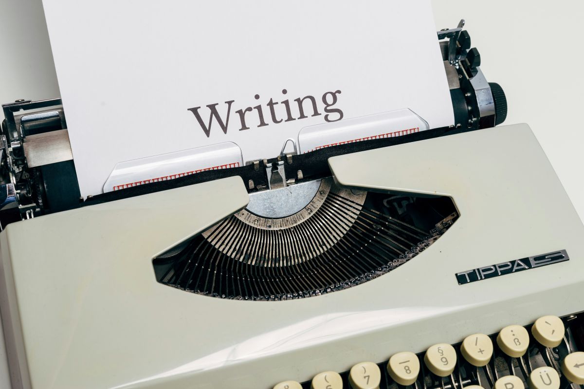
The easiest way to get clean results is to write the copy first, in a plain document, and count it before it goes anywhere near the image tool. A word counter is ideal here because it also shows characters, and character count is what really decides whether a line fits. These are working rules of thumb, not hard limits:
- Title or headline: two to six words. Short titles can be set large, which is what makes a poster read from across a room.
- Subtitle: up to about ten words, one line if possible.
- Labels and legend items: one to four words each. Think map labels, ingredient names, button text.
- Captions and speech balloons: one short sentence. Comic lettering gets cramped fast.
If a line feels long, cut it the way you would cut a headline: drop articles, swap a phrase for a single strong noun, move detail into a separate caption. "An Evening of Poetry Readings at the Old Mill Bookshop" becomes "POETRY AT THE OLD MILL" with "Readings from six local writers" as the subtitle.
The quote-and-place method
Once the copy is counted and trimmed, it goes into the prompt in a specific way. Put every string that must appear in double quotes, exactly as you want it printed, and say where it goes and what role it plays. The pattern looks like this:
- Name the artifact first: poster, product label, comic page, menu, trail map.
- Quote each string separately: the title, the subtitle, each label.
- Give each one a position and a role: "title across the top", "legend in the lower left", "caption box in panel four".
- Finish with the visual style and a reminder such as "crisp legible lettering".
Separating the strings is the important part. If you write the brand name and three product names as one long quoted sentence, the model has to guess where the breaks go. If you quote the brand once and each product name on its own, and say the brand sits above each product name, it has a clear layout to follow. In one published test, a product prompt with a quoted brand name and three quoted flavor names came back spelled correctly on Nano Banana 2 at 4K, with each name on its own label.
A worked example: a reading night poster
Here is the full process for a small event poster, from draft copy to prompt.
- Draft the copy in a document. Title, subtitle, date line, two short details.
- Count and trim. Title: three words. Subtitle: five words. Date line: four words. Details: two words each. Fifteen words in all is comfortable for a portrait poster.
- Proofread before it becomes pixels. Fixing a word here costs nothing.
- Pick the shape. Choose the aspect ratio before writing the scene, because a tall 2:3 or 4:5 poster stacks text differently from a wide 16:9 banner.
- Write the prompt.
Letterpress style event poster in portrait format, cream paper with visible grain. Title across the top in a heavy hand lettered serif: "POETRY AT THE MILL". Subtitle beneath it in small italic serif: "Readings from six local writers". A simple two color illustration of an old stone mill beside a river, ink blue and brick red. Date line near the bottom in bold sans serif: "FRIDAY 7 PM, FREE". Two small labels in the lower corners: "Open mic" and "Tea served". Slight ink misregistration, crisp legible lettering.
The prompt never mentions font sizes. Naming each string's role is usually enough for the model to set the hierarchy.
Proofreading a picture
Even when a model is reliable with quoted text, the output still needs a human proofread, the same as any printed piece. Read the image the slow way:
- Read each string letter by letter against your source document, not from memory.
- Check apostrophes, ampersands, numbers and units. Small marks are where errors hide.
- Look for text the model added on its own. Some models add small extras like icons or a bottle size. Decide whether you want them.
- Check line breaks. A title that splits as "POETRY AT / THE MILL" reads differently from "POETRY / AT THE MILL".
- If something is wrong, fix the prompt and run it again rather than patching the image by hand. Keep the corrected prompt as your master copy.
Keep a simple copy deck listing each image and its approved strings, so a changed date means editing one line and regenerating.
Choosing a tier and a size
Nano Banana 2 sits in the middle of a three tier family. Nano Banana Pro is the top tier, aimed at dense layouts such as multi panel comics and maps with many labels. Nano Banana 2 renders at 1K, 2K or 4K across ten aspect ratios from 1:1 to 21:9, which suits finished product and packaging images. Nano Banana 2 Lite renders at 1K and is meant for fast drafts. Both Pro and Nano Banana 2 accept up to 14 reference images, which is useful when you need to match an existing label design or a character.
A practical way to compare them is to run identical copy through each tier and see which handles your layout best. Several platforms host the family; PixelDojo, for example, runs Nano Banana 2 next to Pro and Lite from one prompt box, so the same quoted strings can be tested across all three without rewriting anything. For print, go to 4K. For social posts and drafts, 1K or 2K is plenty.
The lesson is a familiar one. The tool will set the type, but the words are still yours. Count them, trim them, quote them clearly and proofread the result, and on-image text becomes as dependable as anything else you publish.